Run Charts
A Run Chart shows the manner in which measurement (data points) vary over time or between observations. An annotated run chart includes explanations of the shifts or trends in the data points and where change concepts (solutions) have been tested via PDSA cycles.
- Run Chart Template XLS ~1.9MB
Determining if improvement has really happened and if it is lasting requires observing patterns over time. Run charts are graphs of data over time and are one of the single most important tools in performance improvement. Using run charts has a variety of benefits, they:
- help improvement teams formulate aims by depicting how well (or poorly) a process is performing;
- help in determining when changes are truly improvements by displaying a pattern of data that you can observe as you make changes, and
- give direction as you work on improvement and information about the value of particular changes.
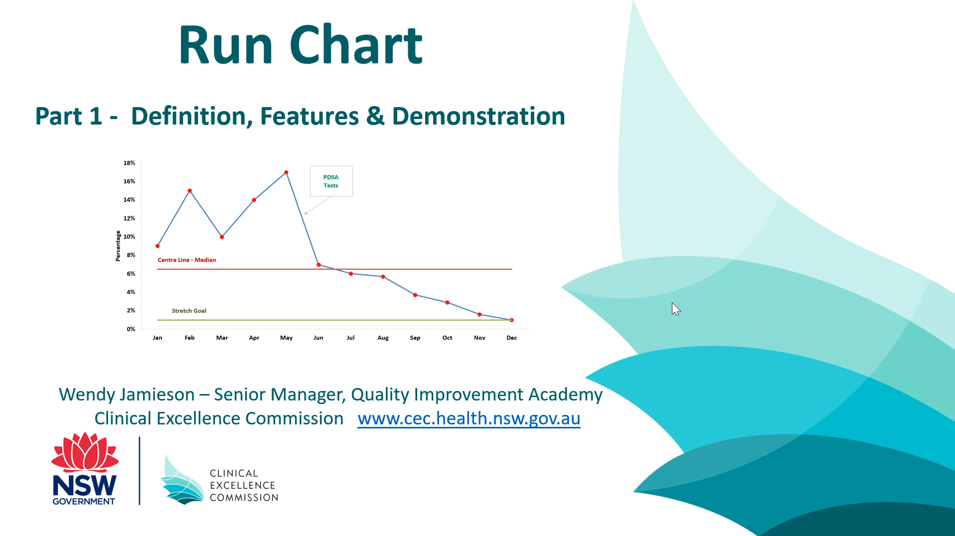
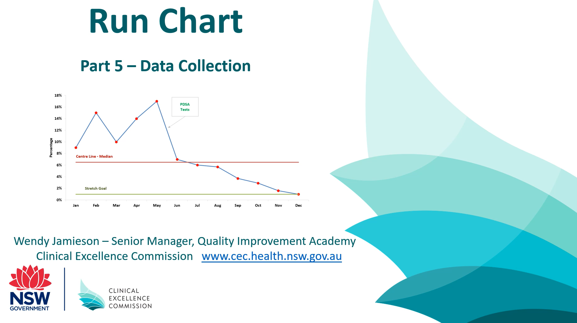
The measure of central tendency (median or the average) of the data can be included in the Run Chart. Traditionally the median is used in run charts until you have more than 20 data points, then the average (mean) may be used. The centre line is indicated by a horizontal reference line (see Median line (in red) in Figure 1). A stretch goal (aspirational target) can also be included as a horizontal line to indicate the desired direction and target of the chart (see Stretch Goal (in green) in Figure 1).
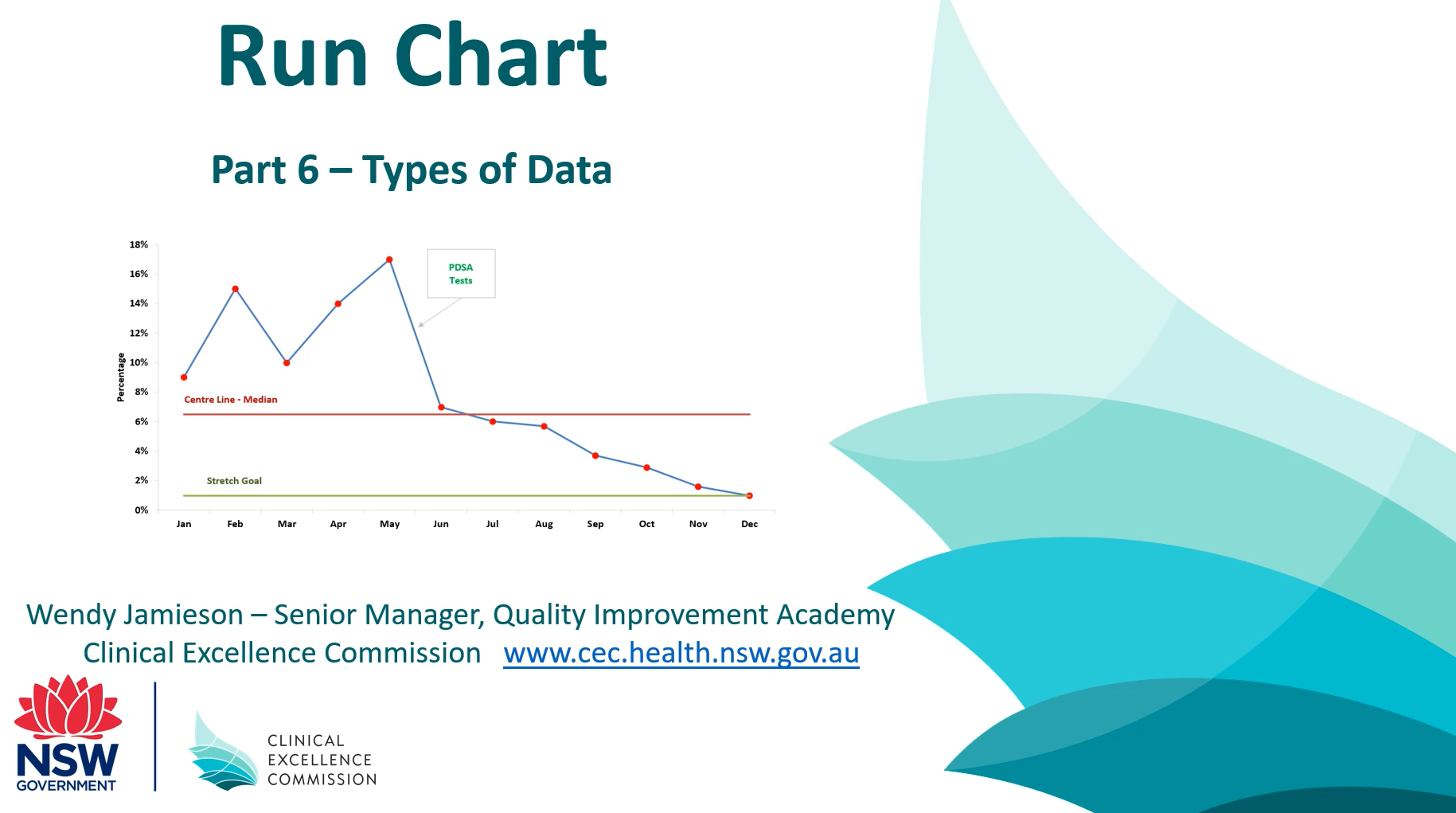
There are 2 types of data that can be used in a Run Chart:
- Continuous (variables) data can take on differing values on a continuous scale, over time eg: length of stay in days, total number of discharges, attendances, time (minutes or hours)
- Attribute (discrete) data are counts of events that can be aggregated into discrete categories eg: acceptable vs. not acceptable; infected vs. not infected; late vs. on time; attendance vs. non attendance.
In the example below (Figure 1) the infection rate of a particular ward is monitored every month (attribute data). A Stretch Goal of 1% infections has been set by the team (an aspirational target they want to achieve). New systems were introduced onto the ward in May which resulted in a desired downward trend (decrease) in the infection rate. By December the stretch goal of 1% was achieved which was the desired outcome (hence the smiley face).
Figure 1: Simple Annotated Run chart of an infection rate over time (attribute data)
")
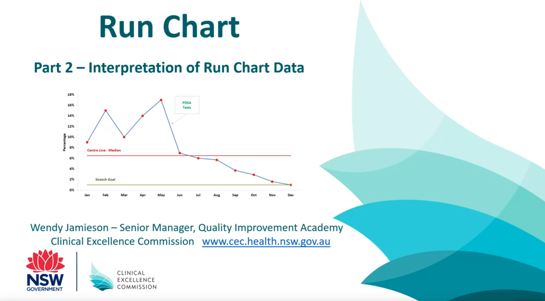
How to interpret a Run Chart (see Figure 2 below)
A run chart works best if there are at least 10 data points ie: 10 days, weeks or months of data or 10 audits/observations.
Shift: A shift in the process is indicated by 6 or more consecutive data points either all above or below the centre line (median or average/mean line). Values on the central line do not add to or break a shift.
Trend: A trend is indicated by 5 or more consecutive data points all going up or down (like values do not add or break a trend).
Astronomical Point: A data point that is an obviously, blatantly different value (an outlier). However a normal maximum value of a data set is not an astronomical point.
A shift, trend or astronomical data point are all signals of non-random patterns and should be investigated to gain a better understanding of the process under review.
Figure 2: How to interpret a Run Chart: Shifts, Trends & Astronomical Data Points

Video Links: Introduction to Measurement for Improvement – Run Charts
Part 1 – Definition and Features of a Run Chart
Platform: YouTube
Length: 26:30 minutes
Part 2 – Interpretation of Run Chart Data
Platform: YouTube
Length: 17:12 minutes
Additional resources
Check the CEC Events Calendar for upcoming Measurement for Improvement webinars and workshops.
Your local Clinical Governance Unit may also have web-based resources or coaching services available.
To learn more about Run Charts please refer to the Institute for Healthcare Improvement website.
Institute for Healthcare Improvement (IHI) video links
Feedback
Was this quality tool web page useful? Do you have suggestions on how we might make it even better?
Please provide us with your feedback via this short evaluation survey.