Control Charts
Control charts, also known as Shewhart Charts or Statistical Process Control Charts (SPCC) are tools used to determine if a process is in a state of statistical control, or how much variation exists in a process. Like run charts, they are graphs of data over time.
Control charts, like run charts, are time-series charts. Depending on the type of data, a particular type of chart is used, with a centre line and upper and lower control limit marked on the chart. These lines are used to distinguish between common and special cause variation, which determines the most appropriate improvement approach.
Common Causes are those that are inherent in a system over time, affecting everyone working in the system and all outcomes of that system. They indicate a stable process that is in statistical control.
If the performance of a stable process is considered to require improvement, interventions will seek to change the system to achieve different results, and establish new control limits for quality control.
Figure 1 - A control chart showing common cause variation (system in statistical control)
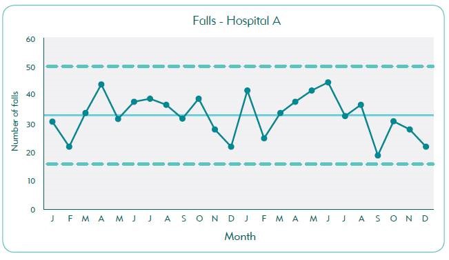
The control chart above (see figure 1) shows common cause variation in the falls rate: that is, the system is stable and performing as well as can be expected. A quality improvement project team may ask "Is this good enough?” and "how can we narrow the gap between the upper and lower lines?"
If a need for improvement is identified, interventions will need to focus on changing the system, through rapid cycle PDSA, to achieve different results.
Special Causes, in contrast, are not part of the system all the time, but arise because of specific circumstances, and indicate an unstable system which is not in statistical control.
The improvement approach in this case is to identify when special cause occurred and why; if positive, improvement efforts may seek to replicate that event as a part of the system, while negative special cause may be the subject of attempts to eliminate the possibility of recurrence and bring the system into statistical control.
Figure 2 – A control chart showing special cause variation (a point outside the lower control limit)
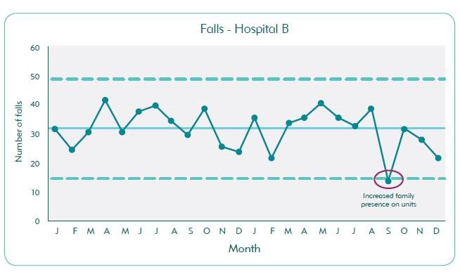
Figure 2, on the other hand, shows special cause in the number of fall incidents, in this case representing improvement. A project team should seek to understand why this occurred, and whether that improvement can be replicated to improve the system overall. Typically, subject matter experts can identify the reasons for special cause.
In Figure 2, an annotation has been added which indicates that the special cause variation was related to an increased presence of relatives and carers in the hospital at lunchtime that month. It may be worth considering adopting the practice of asking relatives and carers of patients at risk of falls to visit at these times.
There are five rules for identifying special cause in control charts to understand whether improvement is occurring:
- A single point outside the control limits
- Eight or more consecutive points above or below the centre line
- Six consecutive points increasing (trend up) or decreasing (trend down)
- Two out of three consecutive points near a control limit (outer one-third)
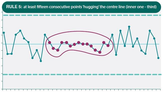
- Fifteen consecutive points close to the centre line (inner one-third).
Figure 3 – Rule # 1 for identifying special cause variation
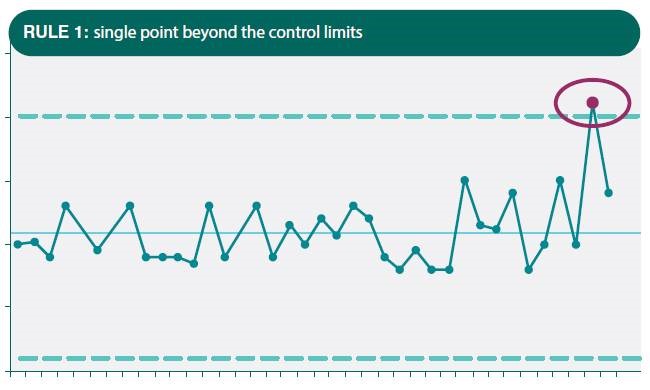
Figure 4 – Rule # 2 for identifying special cause variation
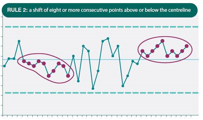
Figure 5 – Rule # 3 for identifying special cause variation
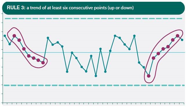
Figure 6 – Rule # 4 for identifying special cause variation
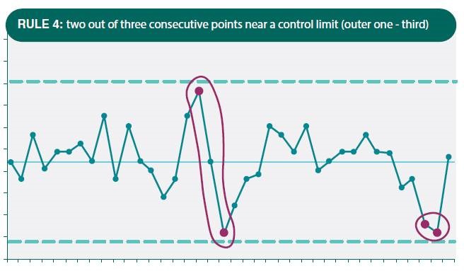
Figure 7 – Rule # 5 for identifying special cause variation
- Control Charts Information sheet PDF ~194KB
Want to learn more
To learn more about Control Charts please refer to the Institute for Healthcare Improvement website. You may need to take a moment and register with the IHI for more in-depth information. Or watch the IHI control chart videos below and read the following resources.
- Understanding Variation with Shewhart Charts – Chapter 9 from Lloyd. R. 'Quality Health Care: A Guide to Developing and Using Indicators', 2nd Edition, Jones & Bartlett Learning, 2019.
- Control Chart Quick Guide by Robert Lloyd
Video links (IHI)
- Control Chart – Part 1 - 5 minute video ~5 mins
- Control Chart – Part 2 - 8 minute video ~8 mins
- "Using Run and Control Charts to Understand Variation" by Robert Lloyd ~56 mins
Feedback
Was this quality tool web page useful? Do you have suggestions on how we might make it even better?
Please provide us with your feedback via this short evaluation survey.
